
Professional photo printing
Introduction
Our beautiful photographs are not only meant to be slumbering on the hard disks. At some point you want to have your works printed / exposed professionally. Many print service providers are bustling on the market, each with a comprehensive offering. This ranges from photo books and calendars to murals made of various high-quality materials. There are no limits for professional suppliers and high quality products can cost up to 1000 Euro. Therefore, it is important to prepare your work optimally for the printing / exposure process. This article will deal with the individual steps to your dream image.
The aim of the whole theme is to make the finished mural look exactly like you did on the monitor before. You will not be able to achieve an absolutely 100% result, because there will always be the smallest deviations, but the finished motif should be very similar to the one on the monitor.
With the help of a photo print on acrylic glass (6 colours UV direct printing) I would like to play through the whole procedure once at the supplier "Saal Digital". The post-processing is done in Photoshop. Why "Saal Digital"? I could have taken any other professional print service provider like Whitewall or CeWe. This is just an example. I would like to stress once again that I do not want to advertise here. But in order to explain this topic well, detailed examples are needed.
From taking a photo to a picture on the wall, your photo should follow these steps:
1. Photographing: In your camera you can set the color space in which the camera should store the photo. More about color spaces and their meaning is explained below. For the greatest possible flexibility in image processing, it should be self-evident that you take photos in RAW format.
The RAW file is developed with Lightroom and / or Photoshop. It is best to specify the color space at the beginning of the image processing. You can change the color space at any time, but it is possible that the colors change visibly and you have to make adjustments again. When you are finished editing, you should keep the RAW files in general. DO NOT delete! You may still need them later!
3. Prepare file for printing / exposure. In this step, the so-called ICC profiles are used. In a final step, the finished photo is reworked by soft proofing before it is uploaded for printing. And that's exactly what this blog is supposed to be about.
Adjusting or calibrating the monitor
The first important prerequisite is the calibration of your monitor.
If your screen displays false colors, is too bright or too dark, you won't see what your images actually look like. And if you don't see this, all the image processing - for which you spend time - is only of limited use.
I myself had not calibrated my monitor for a long time, I used it to edit pictures and then ordered a photo book. All photos were too dark and had differences in colour from the pictures on the monitor.
A colorimeter is used to calibrate the monitor. I myself use the Spyder 5 Pro from Datacolor. The instrument measures the color values, brightness and ambient light. The corrected color values are then transferred via software to the graphics card, which then adjusts the colors on the monitor accordingly.
Of course, the best choice is a monitor with an extended color space, which can also be hardware-calibrated. For example the "Eizo CS 270", which I can highly recommend. This screen has a homogeneous illumination, so there are no differences in brightness or colour. It can also display 100% of the Adobe RGB color space! The hardware calibration allows the colors to be adjusted directly in the monitor without the graphics card having to "bend" a bit.
I do not want to go into too much detail here, because that would go beyond the scope. A very good tutorial on how to calibrate your monitor, as well as tests on hardware calibrated monitors can be found on the website of Gunther Wegner: gwegner. de
Color spaces
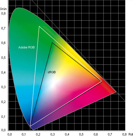
Before we come to work with the soft proof, we have to make a small detour into the subject of color spaces. I would also like to touch on this subject briefly. All you need to know is which color spaces are most commonly used and what color gamut they have.
Technical devices (monitors, cameras, printers, etc.) cannot display all the colours we can see.
A color space indicates which methods and to what extent colors are displayed on different devices and print media.
Printers usually use CMYK color spaces, while monitors use RGB color spaces.
The most common color space for Internet representations is the so-called s-RGB color space. This allows about half of all visible colors to be displayed. This is absolutely sufficient for the representation in the Internet. Even many print service providers use this color space. Most standard monitors can display about 90% of the s-RGB color space. Televisions and projectors also use s-RGB. Some laptops have such insufficient displays that they can display far fewer colors.
A slightly wider color gamut is Adobe-RGB, developed in 1998 by Adobe Systems. Some print service providers use the Adobe RGB color space. This has established itself in the professional printing industry.
Simply put, the larger the color space of the respective device, the more colors it can display.
Integration of ICC profiles in Photoshop
Most print providers provide information about the color space in which your images should be uploaded. And that's exactly what you have to watch out for. The provider "Saal Digital" supports s-RGB, Adobe-RGB and even ProPhotoRGB. For this example I choose the s-RGB color space, because my photo is already edited in s-RGB. If you have a different color space, you can do the same. To change the color space, click on "Edit" -> "Assign profile..."in Photoshop.
Now we have finished editing our photo (on a calibrated monitor!) in the color space s-RGB and want to give it to print / expose. If you uploaded the photo to the print service in this way, it would look different from your monitor. This is because the colors on monitors always look slightly different from those on paper or other media because a monitor has a backlight.
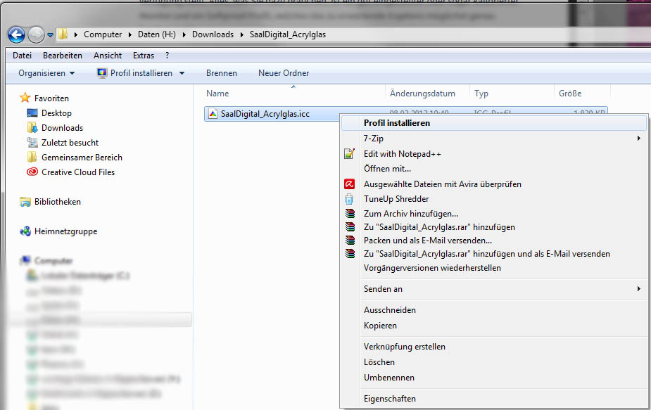
ICC profiles are used to compensate for this situation. These are files that simulate a certain type of paper for a certain printer type. There is an ICC profile for each combination of printer and paper grade. Professional printing services offer the ICC profiles they use for download, such as "Saal Digital".

These files can be included in Lightroom or Photoshop after downloading.
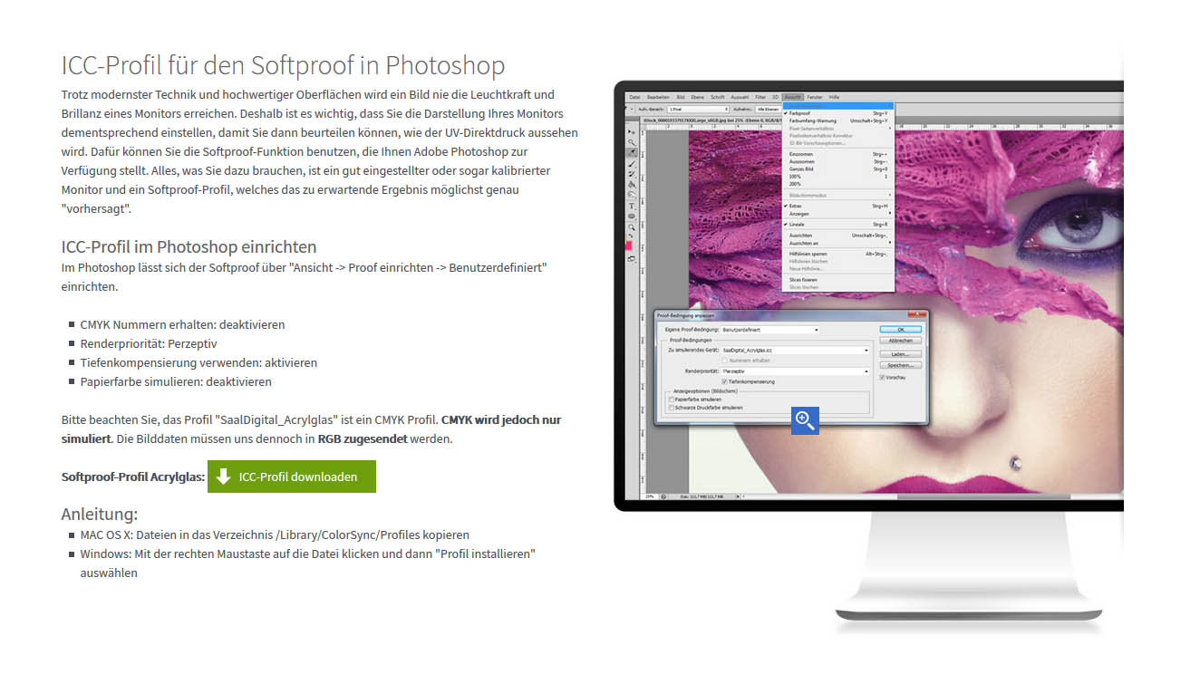
Right-click on the file and select "Install Profile" from the drop-down menu. Then you can select this profile in Photoshop and Lightroom.
With ICC profiles it is therefore possible to see what the printed image looks like later. It's called "softproof".
Preparing the photo for editing in Photoshop
First make a backup copy of your finished photo (I assume for this example my photo "DSC_7474. jpg") and rename the copy to "DSC_7474_Softproof. jpg".
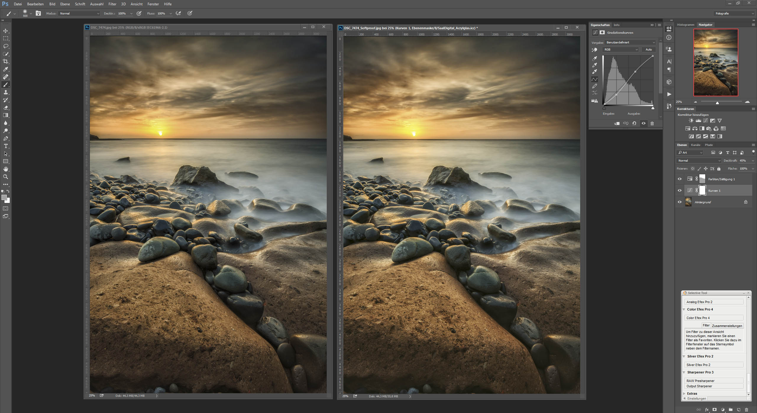
Open both files in Photoshop and place them in such a way that you both have a direct comparison:
Now activates the ICC profile on the image for the softproof: "View" --> "Proof setup" --> "Custom". In "Device to simulate" you select the ICC profile of "Saal Digital" which you downloaded, in our example: "SaalDigital_Acrylglas. icc".
The difference is clearly visible. Photoshop simulates the paper color in the right image. The photo with the softproof activated is slightly brighter and has lost contrast.
Use the CTRL+Y key combination to quickly show and hide the softproof view for comparison.
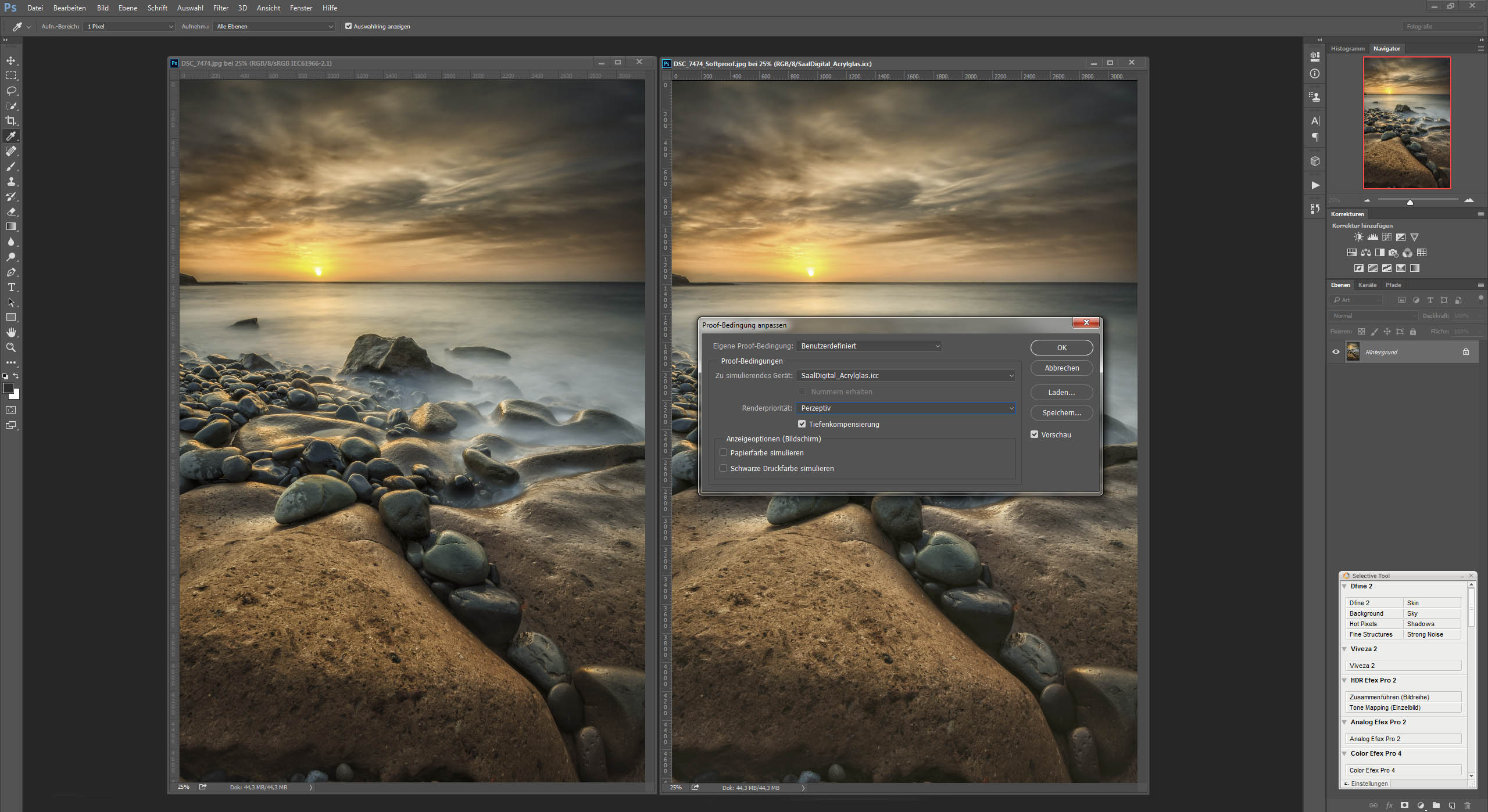
In addition, a color perimeter warning can be activated. In this mode, Photoshop identifies all gray colors that cannot be printed. When printing, simply take the next similar color. Normally, these differences should be so small that they will not be recognized at all. If only very few parts of the picture are affected, you can ignore this. Nevertheless, it is advisable to switch on this "color perimeter warning" to get an overview. Printers sometimes have problems with very intense, bright colours.
For large areas in the picture you should try to reduce the colors a little bit with the "dodger tool" or to reduce the contrast a little bit.
Editing the "softproof photo" with Photoshop
Now we have to adjust the right picture (with activated softproof!) so that it looks like the original again....
In this example I was able to solve this quite easily:
First, I used the gradation curves to give back some contrast to the image. With the slider for "Opacity" I then adjusted the fine adjustment.
After that I raised the yellow tones and the red tones a little more in the area of the sun and the sky. I used a layer mask on the lower part of the stones to get not quite as much saturation in the lower picture area.
And that's what it should have been for editing. Of course, you can work much more precisely here. Absolutely one hundred percent you won't be able to do it. But if you can see almost no difference in looking and comparing, it should be sufficient.
After editing both photos are now identical again. So we "compensated" the difference. When hiding the ICC profile (using the CTRL+Y key combination), the softproof image now looks more saturated and more contrasting.
Now saves the image as "DSC_7474_Softproof. jpg". Now you can upload this file to "Saal Digital" and have it printed as "Photo print on acrylic glass". It will then look exactly like the unprocessed original.
If you want to have a different creation, you will have to repeat the whole procedure with the softproof from the beginning.
This procedure must be repeated for each picture, because each photo is individual. There are no ready-made settings or actions for Photoshop that can be repeated with every photo.
This all looks very much at first glance, but once you get the hang of it, it doesn't take long. In any case you will have a work on your wall, which corresponds exactly to your ideas.
Of course you can also use this procedure for other works and photo books. I hope I was able to shed some light on the different ICC profiles and color spaces.
Interessante Page. Das Design und die nuetzlichen Infos gefallen mir
besonders gut.